

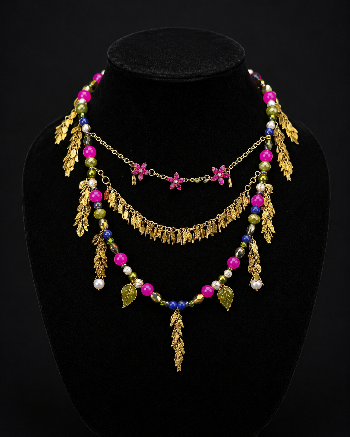
Most of my jewelry has used silver for accents. Gold rarely shone. To broaden my collection, I wanted to create a necklace with gold as its main element. The crystal flowers and golden leaf details give the piece a very tropical feeling. All the beads used have the same color temperature. This allows for the necklace to radiate a very warm vibe. The cohesion, details, and layers make this piece one of my favorites.
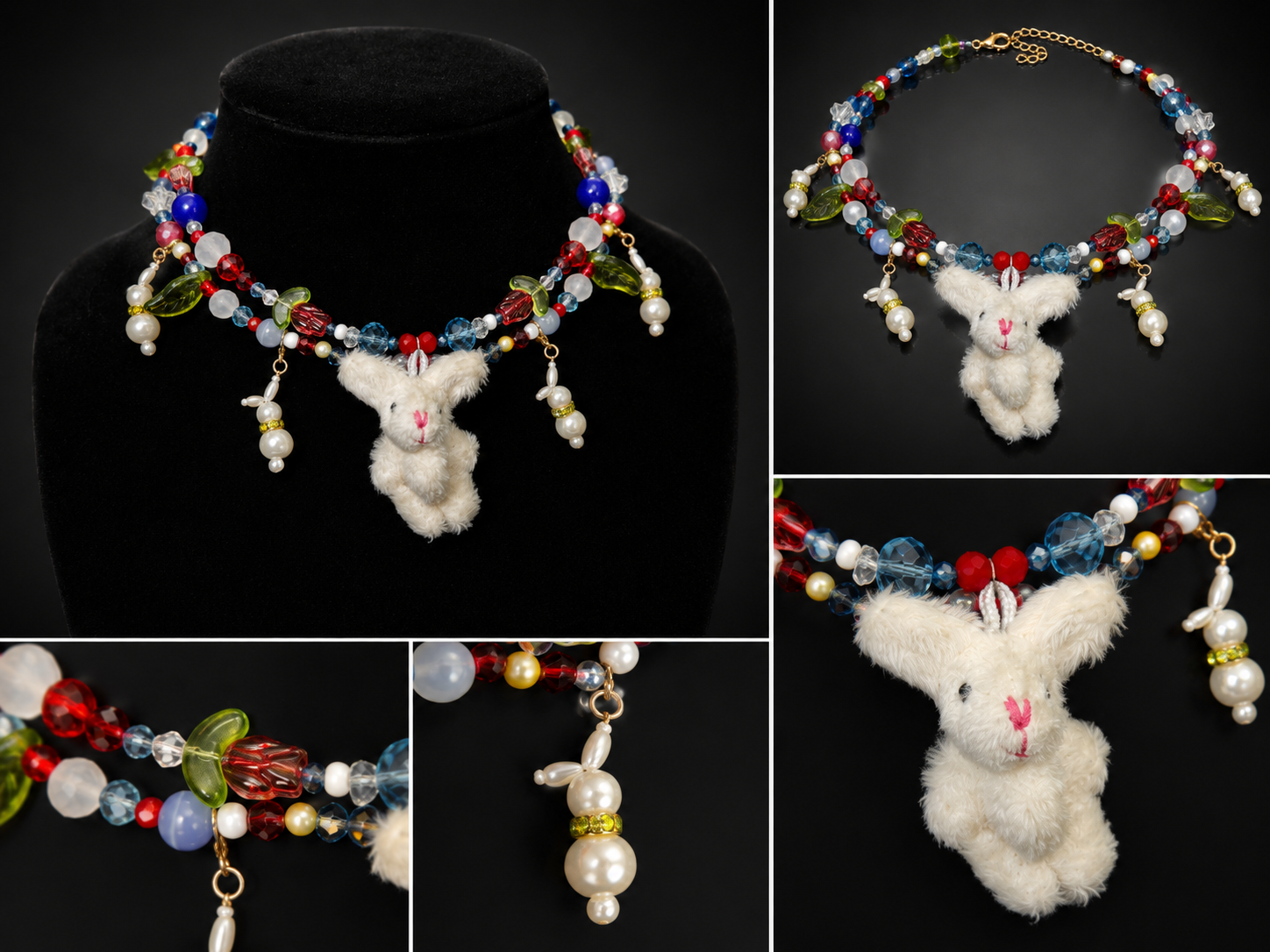
This piece contains two necklaces layered together. They can be worn together or separately. There are some similar beads used in the two necklaces to link them together; the leaves on the bottom match the rose on the necklace on top; bunnies are used as the central detail. But, though there are similar elements, the necklaces aren’t exactly identical. In this way, they can compliment each other while shining on their own as well. The use of many clear beads gives the necklaces a fresh feeling, which aligns nicely with the spring aesthetic of the pieces. The plush bunny contrasts with the necklaces due to its size and solid texture, drawing attention to it.
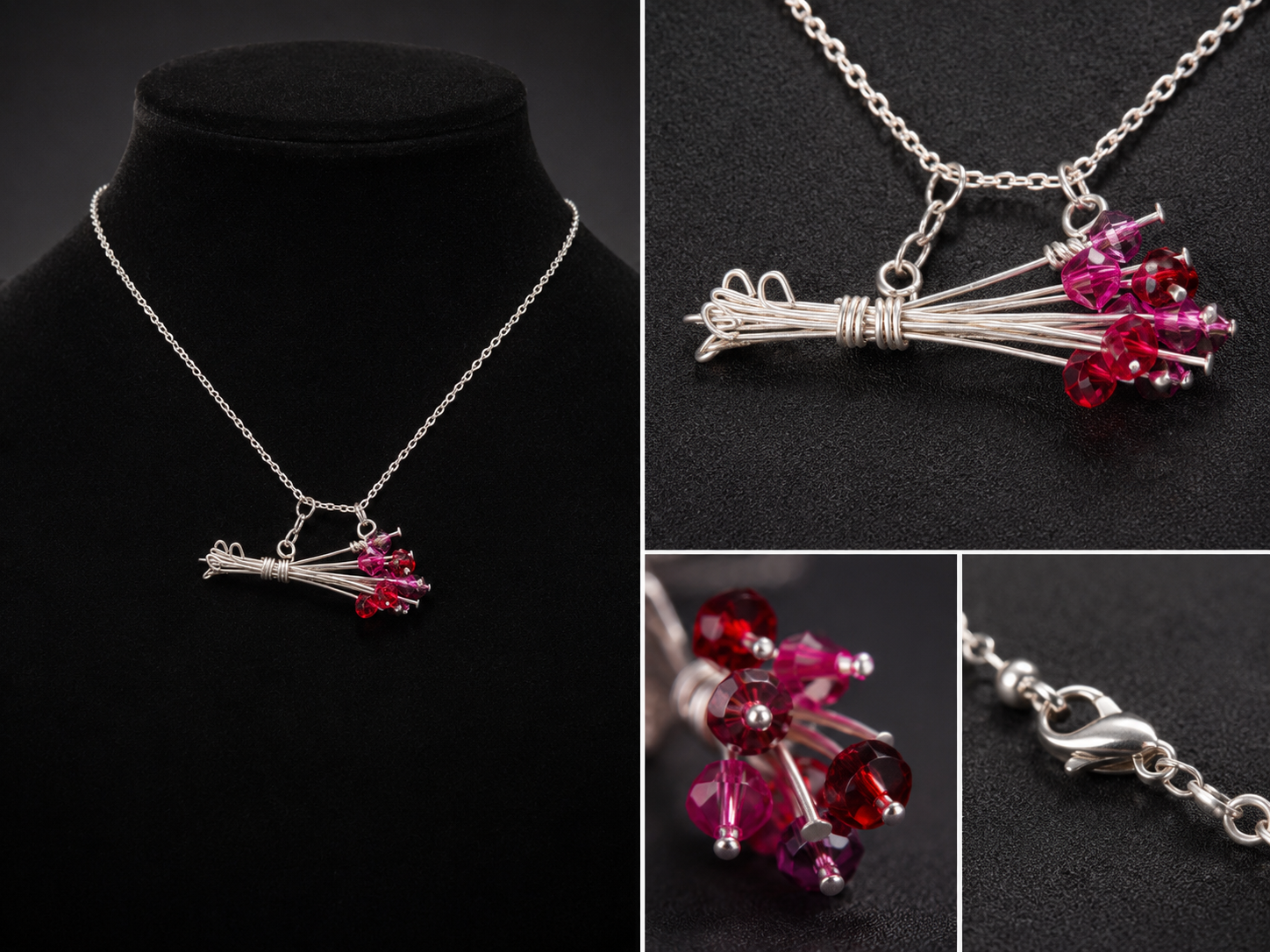
This necklace is very different to what I’ve previously created before. It’s very simple and minimalistic: a simple arrangement of flowers created by wire and beads sit on a thin chain. There are only two colors used, silver and shades of pink. I made this piece around the same time I was creating a logo for Alphreena Jewelry. I wanted an easily recognizable symbol, but presented in a unique way. I drew inspiration from Elsa Peretti’s designs at Tiffany. Her creations are very minimalistic, organic, and iconic. To keep my own identity in this piece, I used beads to create this flower bouquet pendant. I wanted to get comfortable in appreciating and using minimalistic designs to create my logo.
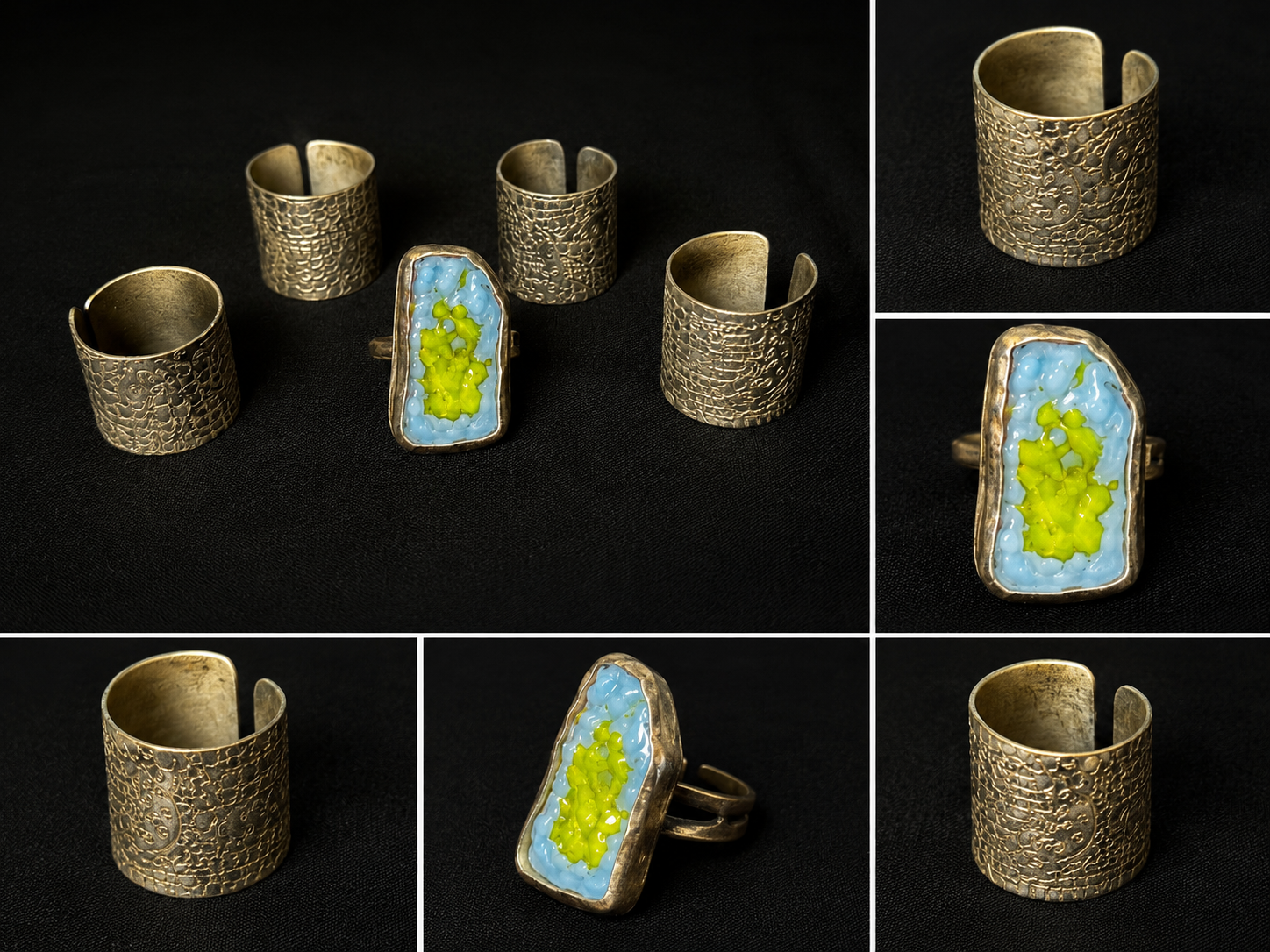
Metalwork is something I’ve experimented with in jewelry classes. I created the stone ring during a class in San Francisco. It helped build the foundation for creating rings for me. I created the set of 4 rings during a precollege program in FIT. Laces, soft and beautiful fabrics, have always been associated with femininity and women. It has always been seen as delicate and fragile. However, lacemaking itself is very difficult. It requires a lot of precision and time. But, as it’s always been associated with women, it is belittled without receiving any of the respect it deserves. To pay homage to lacemaking and grit required for it, I used a marker to draw a lace pattern on a sheet of metal. As the pattern etched into the metal, I created four rings from them.
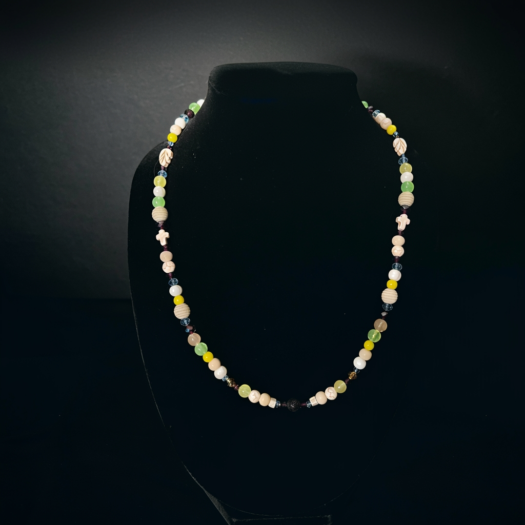
I was inspired to create this piece while I was helping my mom cook an important cultural dish, Olivier. As we moved away early in my childhood, I never got to really experience or connect with my culture. In a way, I was disconnected from it. The dish I helped my mom cook took a lot of time and effort. But, I was proud of the work I had done. I felt closer to my culture and family. I wanted to recreate this process through a necklace. I used beads with colors similar to that of the ingredients and arranged them together. While creating this, I felt appreciation and connection to my culture. While not an entirely conventional way to strengthen roots, jewelry has always been my way of communicating my emotions and thoughts.
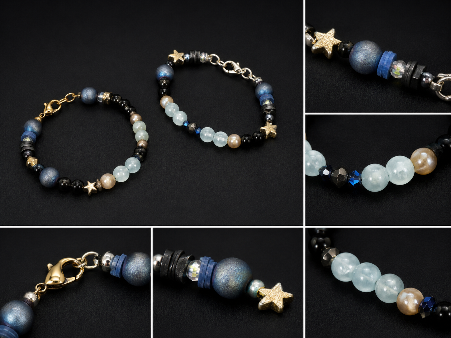
To the left is the first bracelet I’ve ever made. On the right is a newer recreation of it. My love for jewelry making began with bracelets. I was looking for jewelry to wear, but nothing I found suited me. So, I decided to make my own. Before making jewelry, I drew for many years. I found similarities between pairing beads together and drawing. It required a plan, and the motivation to execute it. Bracelets and beads felt solid, while drawing felt more intangible. I enjoyed mixing different beads and shapes to create this bracelet. The finished product felt like wearable art.
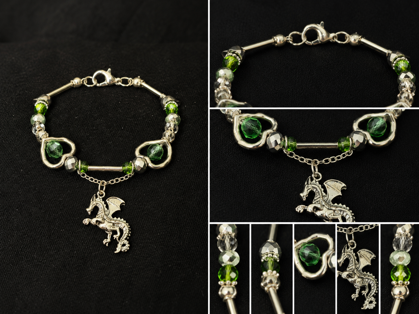
The idea for this bracelet came to me when I was creating a plan for a new necklace. I knew I wanted to use the dragon charm, but a necklace would divert attention away from it. So, I settled for a bracelet. Bracelets, as they’re shorter, allow for more emphasis on the charm. To differentiate this bracelet from my previous ones, I added a layer. The chain connecting the dragon charm to the bracelet brings more attention to the middle. The straight tube beads near the ends put more notice on the beads. The beads get bigger as they get closer to the middle, leading the attention back to the dragon charm constantly.
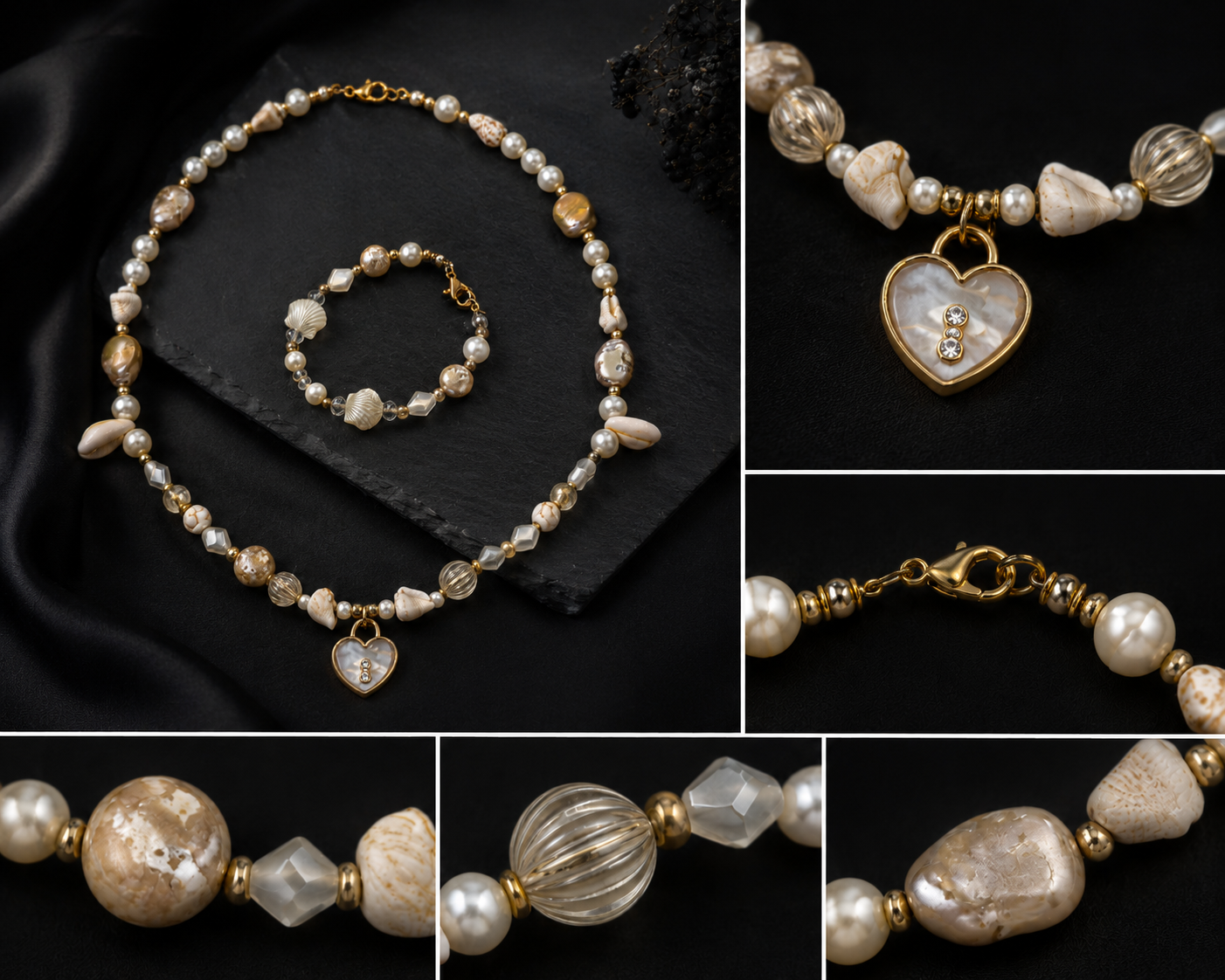
Some necklaces have been created to be worn together, but this was my first time creating a matching pair consisting of a necklace and bracelet. I wanted everything to feel very harmonious and beautiful, like the pendant itself. I used glass, stone, and shell beads to mimic the shine of a pearl. The beachy element comes from the seashells and khaki color, reminiscent of the sand. Various different seashell beads are scattered around, waiting to be caught by the eye (like seashells buried in the sand). The bracelet has a couple different beads, but there's no clear focal point. It’s meant to make the necklace shine, rather than draw attention to itself.
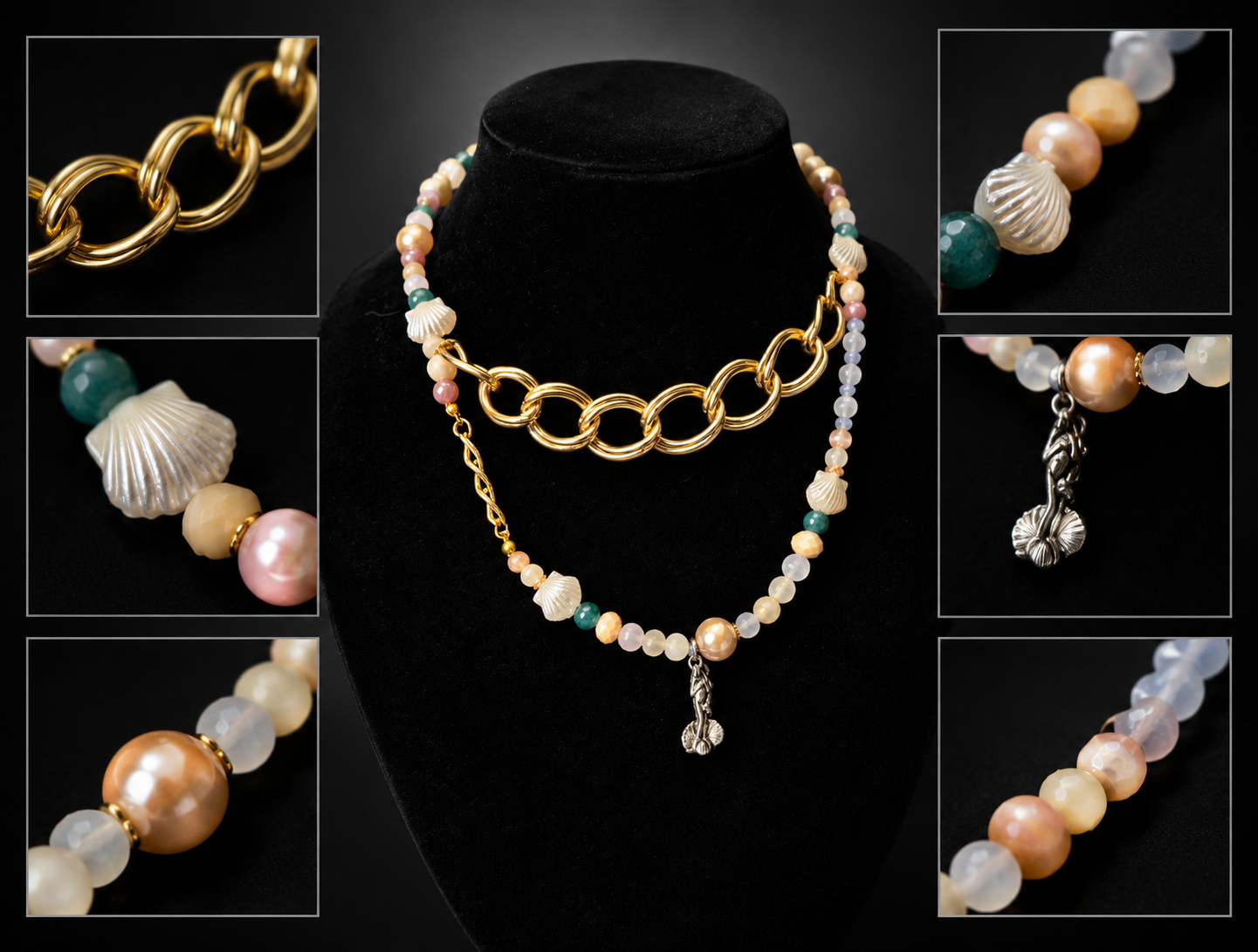
The Birth of Venus by Sandro Botticelli remains one of my favorite artworks. When I found the charm, I knew I wanted to make a necklace inspired by it. The pendant itself is silver, but I wanted to use golden chains for the piece to mimic the warmth of the Renaissance painting. I leaned towards a more asymmetrical look to make this piece more unique. I focused more on capturing the feeling and color of the painting, rather than exact details.
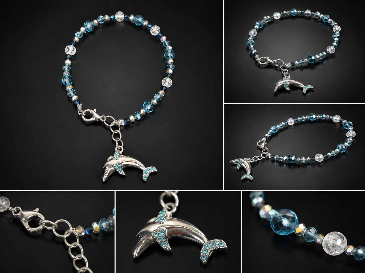
I’m always looking for new ways to improve my jewelry. Most of my pieces have a common element: the center is the focal point. With this bracelet, I wanted to do something different—could I create a piece with the end as its main detail? And so, this bracelet was made. The bracelet itself doesn’t stand out. Blue is the main color, with small amounts of white used for accents. But, all the beads are the same type: clear and sparkly. There’s nothing to catch attention, or hold it. There aren’t any contrasting textures, shapes, or colors. This was done on purpose. All the focus goes onto the dolphin charm, which is at the end of the bracelet. When creating jewelry, I like to pay attention to every single part, be it at the ends or center. If the same care and planning goes into both, why should I limit myself to showcasing only the center, when the ends are just as beautiful?